 This header image was done in Paint Shop Pro and simplified from the steps shown here. Instead of using a vanishing point filter, I just used the text warp / deform option in the text tool. I also added two extra layers - one behind to create over-spray and one right on top to add grain and texture back into the sprayed areas. Lastly, an erase tool was used to create blank areas and flaws in spray distribution for effect. Only problem? Need to find a way to get the letters to overlap in the right order (real graffiti usually overlaps from left to right)
Header image change
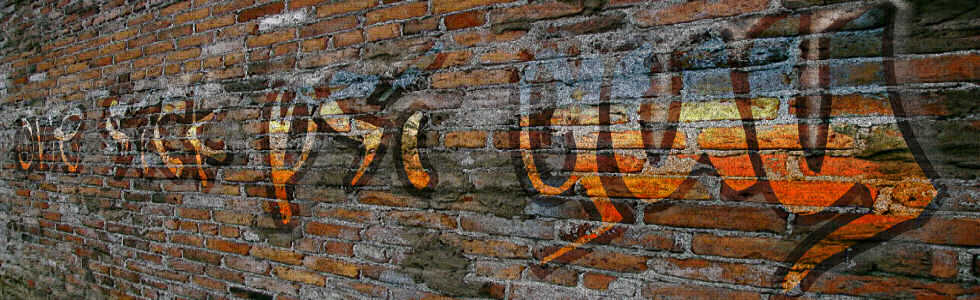
Was getting bored of the original header image on this blog which was simply done and needed a lot of tweaking. Somehow I never got that 'organic' feeling to work properly so I decided to create a new one. Its better but still not perfect ... still like it a lot though since it looks more realistic and more towards the look I'm targeting.
 This header image was done in Paint Shop Pro and simplified from the steps shown here. Instead of using a vanishing point filter, I just used the text warp / deform option in the text tool. I also added two extra layers - one behind to create over-spray and one right on top to add grain and texture back into the sprayed areas. Lastly, an erase tool was used to create blank areas and flaws in spray distribution for effect. Only problem? Need to find a way to get the letters to overlap in the right order (real graffiti usually overlaps from left to right)
This header image was done in Paint Shop Pro and simplified from the steps shown here. Instead of using a vanishing point filter, I just used the text warp / deform option in the text tool. I also added two extra layers - one behind to create over-spray and one right on top to add grain and texture back into the sprayed areas. Lastly, an erase tool was used to create blank areas and flaws in spray distribution for effect. Only problem? Need to find a way to get the letters to overlap in the right order (real graffiti usually overlaps from left to right)
Subscribe to:
Post Comments (Atom)
How about creating the letters separately, move and arrange them to overlap the way you want, group letters to words, then finally add in the graffiti effect?
ReplyDelete